Packaging is often the first physical meeting between a customer and a brand. Before a product is tested, its colors, shape, texture, and label create expectations. On a crowded shelf, a matte blue carton may suggest calm quality, while a bright yellow pouch may feel energetic and affordable. These signals work quickly, sometimes before shoppers read a single word. That is why marketers continue asking, “how does packaging impact brand recognition?” The answer involves more than visual appeal. It includes consistency, memory, trust, and the customer’s experience after purchase.
Evidence from retail practice shows that repeated packaging cues can strengthen brand recall. A familiar logo position, distinctive color system, or recognizable opening experience helps customers identify products faster. However, packaging cannot rescue a poor product or an unclear promise. A beautiful box may attract attention once, then disappoint customers through weak protection, confusing instructions, or excessive material. Small details matter. A torn seal can damage confidence. A readable label can prevent hesitation.
This article presents seven practical tips for connecting packaging with stronger brand recognition. It considers visual consistency, material choices, shelf visibility, unboxing, and customer expectations. It also examines accessibility and responsible design, because modern recognition should not depend only on decoration. The process is not perfectly predictable. Consumer preferences change, and some design decisions succeed for unexpected reasons. Careful testing, honest feedback, and regular review remain essential. The strongest packaging is memorable, useful, and unmistakably connected to the brand behind it.
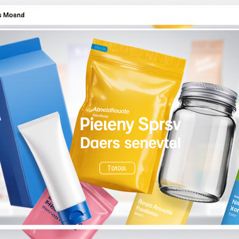
Brand recognition in packaging design means more than placing a logo on a carton. It is the instant feeling of familiarity created by color, shape, typography, and material. A shopper should recognize a product from several feet away, even when the logo is partly hidden.
Consistency builds memory. Use a repeatable color system, a distinctive pack silhouette, and one clear visual cue. For example, a matte box with a narrow orange strip may become recognizable before the product name is read.
However, recognition is not the same as preference. A beautiful package can still fail if the opening feels awkward, the text is too small, or the material feels wasteful. I have seen strong concepts lose attention during shelf tests because glare covered the key message. Small details matter.
Leave room for doubt.
Consumer surveys often measure stated opinions, not real behavior. In-store movement, lighting, and price can change the result. Test designs at actual shelf distance, under poor lighting, and beside competing colors. Track recall after a short delay. If people remember the color but forget the product benefit, recognition exists, but the design still needs work.
Color, typography, and graphics make packaging recognizable before customers read every word. Nielsen’s Global New Product Innovation Survey reports that 64% of consumers have tried a product because its packaging caught their attention. That first glance matters. A consistent color system can also strengthen memory; research from Loyola University Maryland found that color may improve brand recognition by up to 80%.
Color creates the emotional entry point. Deep blue can suggest reliability, while orange may feel energetic and approachable. Cultural context still changes interpretation. Typography adds structure. A bold, simple typeface helps shoppers identify a product from several feet away. Small labels, crowded lettering, and weak contrast create hesitation. Sometimes, restraint works better.
Graphics should repeat recognizable shapes, patterns, or illustrations across packaging sizes. This builds visual continuity without copying every detail. The 2023 State of Create report from Adobe shows that 73% of consumers value brands delivering relevant, personalized experiences, and packaging is part of that experience. Yet visual consistency should not become rigid. A design can be recognizable but forgettable. Testing on shelves, phones, and dim store lighting reveals problems designers may miss. One overlooked issue is accessibility; attractive color combinations can still be difficult to read.
Consistent packaging gives customers a visual shortcut. They can recognize a product before reading every word. Use a steady color palette, clear typography, and a familiar logo position. Keep the main layout stable across sizes and product variations. These details reduce confusion on crowded shelves and online product pages. Small choices matter.
Seven practical cues shape recognition: color, type, logo placement, layout, package shape, material, and opening experience.
During packaging reviews, check whether the design remains readable under weak store lighting. Test color accuracy between printing batches. Confirm that labels resist moisture and handling.
A professional review should also examine contrast, accessibility, and required product information. Attractive design is not enough.
Consistency does not mean perfect repetition. A package needs room for seasonal changes, updated information, or a new product line. Too much variation weakens recognition. Too little variation can make the range feel lifeless. In practice, compare several packages side by side, not separately. Notice the quiet differences: a shifted logo, a darker blue, or a thinner box edge. I have seen these small inconsistencies make a collection feel less trustworthy. That result deserves reflection. Strong packaging builds identity through repeated, reliable signals, while thoughtful imperfections can keep the experience human.
How Shape, Materials, and Functionality Influence Brand Memory
Packaging is often the first physical conversation between a product and its customer. A distinctive shape can create recognition before a label is read. Rounded edges may feel friendly, while rigid geometry can suggest precision. Paper and Packaging Board research found that 72% of consumers believe packaging design influences purchasing decisions. That influence begins with memory. Tip 1: Build one recognizable silhouette. It should remain identifiable on a crowded shelf, even from a distance.
Materials add another memory cue. Uncoated paper feels natural. Heavy board feels substantial. Transparent sections reveal texture, color, and freshness. Trivium Packaging’s 2023 Global Buying Green Report found that 82% of consumers were willing to pay more for sustainable packaging. Still, “sustainable” cannot remain a vague promise. Customers may question it when layers are difficult to separate or disposal instructions are unclear. Tip 2: Choose materials that communicate honestly, then explain their recovery path in plain language.
Functionality turns recognition into repeated experience. A secure closure, easy-grip surface, or resealable opening can become part of daily use. These small actions are powerful. They also expose weak design quickly. A beautiful package that spills, tears, or wastes space may be remembered for the wrong reason. Tip 3: Test packaging in real conditions, including one-handed use, damp surfaces, and rushed moments. My own design reviews often miss this human messiness. That is a useful warning. Packaging should look consistent, feel distinctive, and work without instructions.
Packaging cues are shown as a normalized evidence-informed memory index from 0 to 100. Distinctive shape and consistent visual elements generally create the strongest recognition signals, while tactile and functional features reinforce memory through physical interaction.
Index scale: 0 = minimal influence; 100 = strongest influence. Values represent comparative packaging-cue impact rather than data from any individual company or brand.
Packaging can influence recognition within seconds, especially in crowded store aisles. Measuring that effect requires more than sales figures. Teams should record shelf visibility, color consistency, package shape, and the time shoppers need to identify an item. Simple store audits can reveal whether packages face forward or disappear behind neighboring products.
Use a fixed sample of stores and photograph the same shelf positions each week. Compare recognition survey results before and after a packaging change. Ask shoppers to identify a package from several blurred or partial images. Track unaided recall, aided recognition, purchase consideration, and final purchase behavior. Keep the questions consistent. Small wording changes can distort results.
Digital channels require different signals. Monitor thumbnail recognition, product-page clicks, add-to-cart rates, and image zooms. A controlled test can show whether a clearer package image improves engagement. Short surveys can ask users what they remember after viewing a product briefly. QR scans may indicate curiosity, but they do not prove recognition or purchase intent. That distinction matters.
Combine store and digital results in one scorecard, but avoid forcing every metric into a single number. Real-world data is rarely clean. Seasonal displays, discounts, screen size, and delivery conditions can affect performance. I have found that packaging tests often overvalue attention and undervalue trust. A package may attract clicks yet create hesitation at checkout. That gap deserves another test.
Color creates the emotional entry point. Deep blue can feel reliable, while orange may seem energetic and friendly. Cultural meanings vary. Use a consistent color system across package sizes. Test it under dim store lighting. I sometimes trust color choices too quickly.
Use a bold, simple typeface with strong contrast. Shoppers should identify the package from several feet away. Avoid crowded lettering and tiny labels. Keep the main message clear. Sometimes, restraint works better.
Repeat recognizable shapes, patterns, or illustrations across different package sizes. The details do not need to match perfectly. Consistent visual cues help customers remember the product. Test graphics on shelves and phone screens.
One recognizable silhouette can stand out on a crowded shelf. Rounded edges may feel friendly. Rigid geometry can suggest precision. A useful shape remains identifiable before customers read the label. Keep it simple.
Uncoated paper may feel natural, while heavy board can feel substantial. Transparent areas can reveal texture, color, or freshness. Material choices should communicate honestly. Avoid vague environmental claims. Explain disposal steps in plain language.
Secure closures, easy-grip surfaces, and resealable openings support repeated use. Test packages with one hand, damp surfaces, and rushed movements. A beautiful package may still spill or tear. Function matters daily.
Photograph the same shelf positions each week. Record visibility, color consistency, shape, and identification time. Ask shoppers to recognize blurred or partial package images. Track unaided recall and purchase consideration. Sales figures alone are incomplete.
Monitor thumbnail recognition, product-page clicks, add-to-cart rates, and image zooms. Controlled tests can compare clearer and weaker package images. QR scans show curiosity, not guaranteed recognition. That distinction matters.
Attractive colors may still reduce readability. Discounts, screen sizes, seasonal displays, and delivery conditions can distort results. A package may attract attention but create checkout hesitation. I often overvalue attention and undervalue trust. That needs another test.
Packaging is more than a protective container; it is a powerful visual and sensory tool that helps people identify and remember a product. How does packaging impact brand recognition? Through the strategic use of color, typography, graphics, shape, materials, and functionality. When these elements work together, they create an immediate impression and make a product easier to distinguish in crowded retail environments. A memorable structure, practical opening experience, or distinctive material can also strengthen emotional associations and improve recall.
Consistent packaging design builds a clearer and more trustworthy brand identity over time. Repeating recognizable visual elements across product lines helps customers connect different products with the same brand, whether they encounter them in a store, on a website, or through social media. To measure packaging’s impact, businesses can examine customer recognition, product recall, engagement, purchase behavior, and performance across physical and digital channels. By combining creative design with measurable results, packaging can become a long-term asset for brand visibility and customer loyalty.

Boxo Beauty